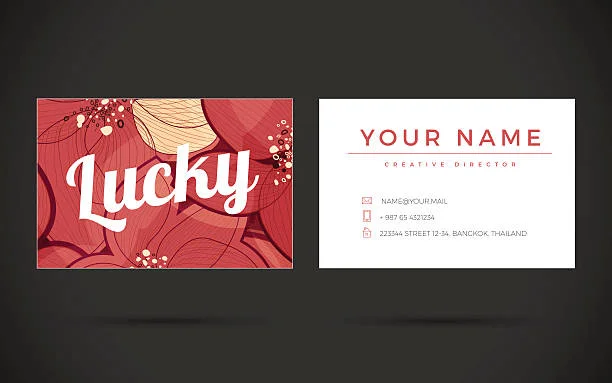
If your business cards feel a bit “meh” instead of memorable, you are not alone. Lots of brands want a premium feel but end up with something that looks generic. The good news is you do not need loud colours or over the top effects to look high-end. Subtle luxury is all about small details that quietly say, “I take my brand seriously.”
Start With Paper That Feels Expensive
Before anyone reads your name, they feel your card. That first touch sets the tone. Choosing a thicker stock that feels sturdy immediately communicates quality. Softer options such as cotton, textured or soft-touch stocks add a sense of refinement that shiny, flimsy cards cannot match. When your card feels substantial in the hand, it suggests professionalism, care and attention to detail before anyone even looks at the design.
Choose a Calm, Confident Colour Palette
Luxury rarely shouts. It usually speaks in calm, confident tones. Instead of using every brand colour, focus on a simple, refined palette. Deep navy, charcoal, forest green, rich burgundy or warm neutrals instantly feel more premium than harsh brights. Limiting yourself to one main colour and a subtle accent keeps your card looking cohesive rather than cluttered. When your colours are controlled and considered, your brand feels more trustworthy and established.
Let Typography Elevate Your Brand
Fonts are one of the easiest ways to add quiet sophistication. A thoughtful pairing of a modern sans serif with a refined serif can create a strong, stylish contrast. Use size and weight to guide the eye, with your name slightly larger than your role and contact details. Generous spacing makes everything easier to read and stops the design from feeling cramped. Skip novelty fonts and focus on clarity and elegance. When your typography feels deliberate, your card feels premium even if the layout is simple.
Add Special Finishes With Restraint
Special finishes are where subtle luxury really comes to life. The trick is using them sparingly. A hint of foil on your logo, a touch of spot UV on a pattern or a debossed brand mark can add depth and interest without overwhelming the design. These details invite people to tilt, touch and look twice. Working with a company that offers premium business card printing helps you choose finishes that enhance your design rather than fight with it.
Embrace White Space for a High-End Look
Nothing says confident design like white space. Instead of filling every corner with text and icons, strip your content back to what people actually need: your name, role, main contact details and maybe one key link. Leaving generous space around these elements instantly makes your card feel more modern and luxurious. The back of the card can be simple too, perhaps just your logo, a solid colour or a short strapline. Simplicity makes your card easier to read, easier to remember and much more visually appealing.
In Conclusion
Subtle luxury is not about showing off, it is about showing care. When you combine quality paper, a refined palette, thoughtful typography, restrained finishes and plenty of white space, you create a business card that feels as considered as the brand behind it. That tiny rectangle often provides the first physical impression of who you are. Make sure it says you are confident, polished and worth remembering, without ever needing to shout for attention.
Check this featured posts for standout ideas and insights you won’t want to miss.

